오늘은 Material Design Chip을 활용한 TextView FlowLayout을 구현한걸 기재 하려 합니다.
💡 Android에서 어떤 키워드 혹은 카테고리, 요소, 타입 등을 표현할 때 종종 타원형의 background에 그 텍스트를 표현하게 됩니다. 이때 Material Design에서 이를 구현하기 위해 Chip을 제공해줍니다.
https://material.io/components/chips#input-chips
Material Design
Build beautiful, usable products faster. Material Design is an adaptable system—backed by open-source code—that helps teams build high quality digital experiences.
material.io
그럼 왜? Material Design Chip을 활용해서 TextView FlowLayout을 구현하려 했는지 부터 설명 드립니다.
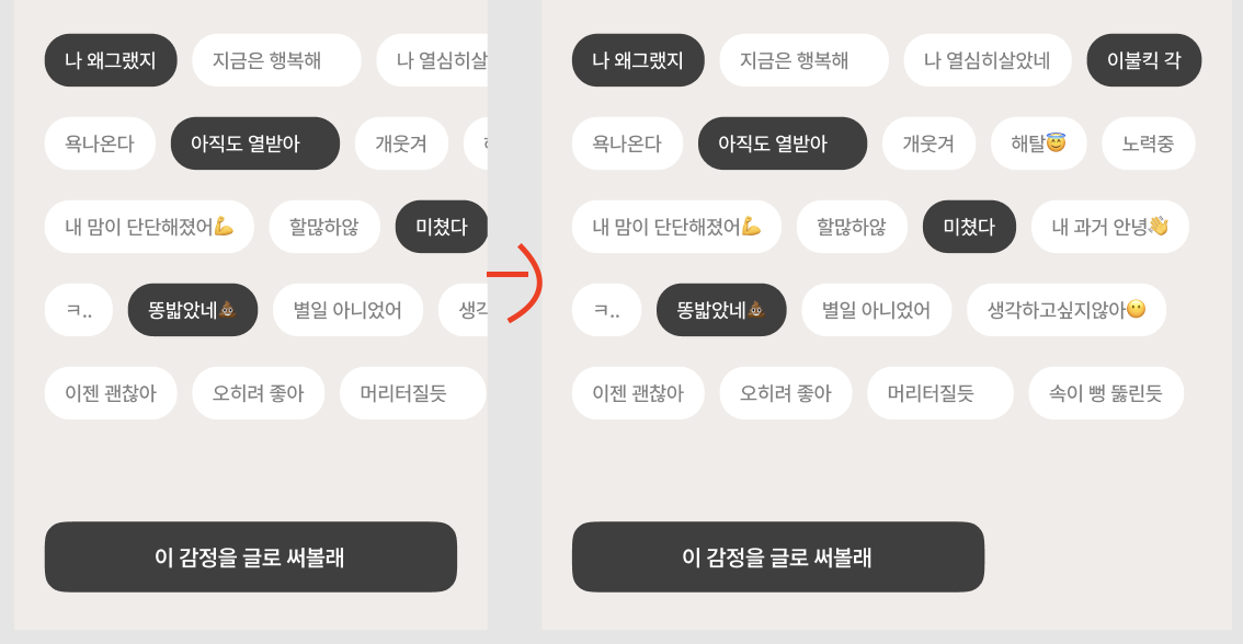
현재 디프만 10기로 활동 중 프로젝트에서 아래와 같은 UI로 화면을 구성하도록 디자인팀에서 요청해왔습니다.
헉...!!😫 😫 😳 😱 이걸 어떻게 해야되는지... 깜깜했습니다.
막간의 홍보 BBOXX Android App Install URL !!!
막막했는데.. 팀원이 FlowLayout이라는 키워드를 전달 해줬습니다. 검색을 해보니 구성해야 될 UI 구조와 동일했습니다.
그래서, 자!! 이제 시작해보자!! 그런데 연관 키워드로 Material Design Chip도 확인이 되었습니다!! 보자마자!! 이거다~!! 그래 이걸로 조금 더 이쁘게 잘 활용해보자!! 😆 🥳 🥳 🥳
설정
build.gradle — dependencies 추가합니다.
implementation 'com.google.android.material:material:1.0.0-beta01'
주요사항
📍 res > value > style 에서 AppCompat 테마로 지정하게 되면 App Crash 발생
java.lang.IllegalArgumentException: The style on this component requires your app theme to be Theme.MaterialComponents (or a descendant).
📌 해결방안
-> MaterialComponents 테마 중 하나를 상속하도록 앱 테마를 설정합니다.
<style name="AppTheme" parent="Theme.MaterialComponents.Light.NoActionBar">
- AppTheme Style
<style name="AppTheme" parent="Theme.MaterialComponents.Light.NoActionBar">
    <item name="colorPrimary">@color/colorPrimary</item>
    <item name="colorPrimaryDark">@color/colorPrimaryDark</item>
    <item name="colorAccent">@color/colorAccent</item>
    <item name="chipIconTint">@color/chipIconTint</item>
</style>
Chip 구성
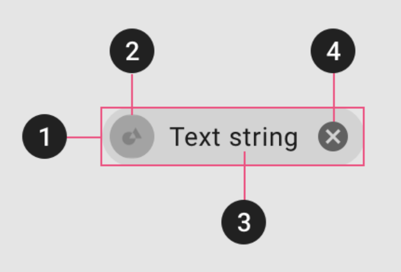
Material Design은 Chip을 크게 4개로 구성하여 설명해줍니다.
- Container : 텍스트를 둘러싼 하나의 도형
- Thumbnail(Optional) : 로고나 아이콘을 보여줌으로써 텍스트의 의미를 보충해주는 역할을 합니다. (선택사항)
- Text : 사람 이름, 카테고리명 등 텍스트로써 보여주는 부분입니다.
- Remove Icon (Optional) : x 아이콘을 누름으로써 Chip을 삭제할 수 있는 버튼 (선택사항)
- Chip Introduction
<com.google.android.material.chip.Chip
    android:layout_width="wrap_content"
    android:layout_height="wrap_content"
    android:text="@string/chip_text" />
Chip 테마 (참조)
Material Design Chip에서 4가지 테마를 정의 해주고 있습니다.
- Entry Chip : 복잡한 정보를 간략하게 보여 줄 때 사용하도록 권장. Chip 아이콘과 닫기 아이콘을 별도로 설정이 가능. 추가적으로 체크 상태(선택된 상태)를 지정이 가능합니다.
<com.google.android.material.chip.Chip style="@style/Widget.MaterialComponents.Chip.Entry" android:layout_width="wrap_content" android:layout_height="wrap_content" android:text="@string/chip_text" app:chipIcon="@drawable/ic_avatar_circle_24"/>
Entry Chip - Fliter Chip : 검색 결과나 내용등에 필터를 걸 때 사용하도록 권장. 추가로 체크 상태(선택된 상태)를 지정이 가능합니다.
<com.google.android.material.chip.Chip android:id="@+id/chip13" style="@style/Widget.MaterialComponents.Chip.Filter" android:layout_width="wrap_content" android:layout_height="wrap_content" android:text="@string/chip_text" />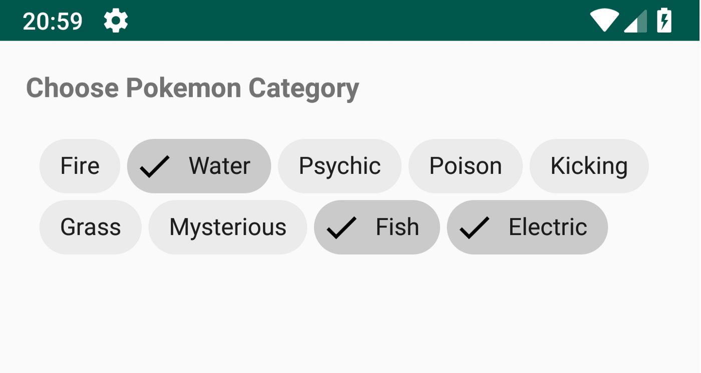
Filter Chip - Chioce Chip : 한정된 Chip 갯수 중에서 단일 선택을 수행할 때 사용하도록 권장. 항상 체크 상태를 지정하게 됩니다.
<com.google.android.material.chip.Chip android:id="@+id/chip4" style="@style/Widget.MaterialComponents.Chip.Choice" android:layout_width="wrap_content" android:layout_height="wrap_content" android:text="@string/chip_text" />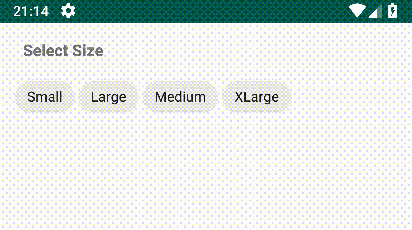
Choice Chip - Action Chip : 기본 설정 Chip. 어떤 Action을 수행하거나 컨텐츠의 주제등을 보여줄 때에 사용하는 것을 권장. Chip 아이콘을 설정 가능하며, 체크상태를 지정할 수 없는 특징이 있습니다.
<com.google.android.material.chip.Chip android:id="@+id/turnLightsOnChip" style="@style/Widget.MaterialComponents.Chip.Action" android:layout_width="wrap_content" android:layout_height="wrap_content" android:text="@string/chip_text" app:chipIcon="@drawable/baseline_brightness_5_black_24" />
Chip 구성요소와 테마를 살펴보았습니다. 여기서 제가 써야하는 Chip 테마는 Choice를 선택하였습니다.
그런데 위의 디프만 화면을 만들기에는 Chip을 활용하여 하나씩 화면에 배치하기에는 무리가 있었으나, ChipGroup 다수의 Chip을 관리할 수 있는 Layout을 보게 되었습니다. FlowLayout을 안쓰고 ChipGroup을 사용해보자 하며 시도하였습니다.
<!-- XML -->
<com.google.android.material.chip.ChipGroup
    android:id="@+id/chip_group"
    android:layout_width="match_parent"
    android:layout_height="306dp"
    android:layout_marginHorizontal="24dp"
    app:layout_constraintStart_toStartOf="parent"
    app:layout_constraintEnd_toEndOf="parent"
    app:layout_constraintTop_toBottomOf="@+id/top"
    android:checkable="true"
    android:clickable="true"
    android:focusable="true"
    style="@style/CustomChipChoice">

</com.google.android.material.chip.ChipGroup>
<!-- XML -->


<!-- Theme -->
<style name="CustomChipChoice" parent="@style/Widget.MaterialComponents.Chip.Choice">
    <item name="chipBackgroundColor">@color/white</item>
    <item name="android:textColor">@color/gray_10</item>
</style>
<!-- Theme -->
In Activity
val dummyTexts = resources.getStringArray(R.array.feel_tag)
chipGroup = binding.chipGroup
dummyTexts.forEach {
  val chip = Chip(requireContext())
  chip.text = it
  chip.textSize = 16F
  chipGroup!!.addView(chip)

  chip.setOnClickListener {
    chip.setTextColor(Color.WHITE)
    chip.setChipBackgroundColorResource(R.color.mypage_bg)

    listData.add(chip.text.toString())

    if(listData.size == 5){
    	changeBtn()
  	}
  }
}
위와 같이 작업을 했으나... 디자이너 팀에서 원하는 화면인 옆으로 스크롤 되면서 밑으로 내려가는 화면이 아니였습니다...
View화면에 가득찬 형태로 만들때는 사용해도 되나 디자이너 팀에서 원하는 화면일 경우는 다시 원점으로 돌아와서 FlowLayout과 RecyclerView를 혼용해서 써야 겠구나!! 뇌리를 스쳐지나갔습니다. 🥸 🤔 🧐 🤩
- RecyclerView Item
<!-- RecyclerView Item -->
<androidx.constraintlayout.widget.ConstraintLayout
    android:layout_width="wrap_content"
    android:layout_height="wrap_content"
    android:background="@color/main_bg">

	<com.google.android.material.chip.Chip
        android:id="@+id/chip_name"
        android:layout_width="wrap_content"
        android:layout_height="wrap_content"
        android:layout_marginHorizontal="4dp"
        android:text="@{vm.tag}"
        android:textSize="16sp"
        android:checkable="true"
        android:clickable="true"
        android:focusable="true"
        style="@style/CustomChipChoice"
        app:layout_constraintStart_toStartOf="parent"
        app:layout_constraintEnd_toEndOf="parent"
        app:layout_constraintTop_toTopOf="parent"
        app:layout_constraintBottom_toBottomOf="parent" />
</androidx.constraintlayout.widget.ConstraintLayout>- RecyclerView
<androidx.recyclerview.widget.RecyclerView
    android:id="@+id/ry_growth"
    android:layout_width="499dp"
    android:layout_height="wrap_content"
    app:layoutManager="androidx.recyclerview.widget.LinearLayoutManager"
    android:orientation="horizontal"
    android:overScrollMode="never"
    android:nestedScrollingEnabled="false"
    android:paddingBottom="20dp"
    android:clipToPadding="false"
    android:layout_marginStart="24dp"
    android:layout_marginTop="54dp"
    tools:listitem="@layout/item_select_feel_tag"
    app:layout_constraintStart_toStartOf="parent"
    app:layout_constraintTop_toBottomOf="@+id/txt_grow_tag_select"
/>- RecyclerView 에서 FlexBoxLayout를 활용을 위해 build.gradle 추가 ( 참조 )
implementation 'com.google.android.flexbox:flexbox:3.0.0'- In Activity
val flexboxLayoutManager = FlexboxLayoutManager(requireContext()).apply {
flexWrap = FlexWrap.WRAP
flexDirection = FlexDirection.ROW
alignItems = AlignItems.STRETCH
}
binding.ryTest.run{
layoutManager = flexboxLayoutManager
adapter = growthNoteTagAdapter
setHasFixedSize(false)
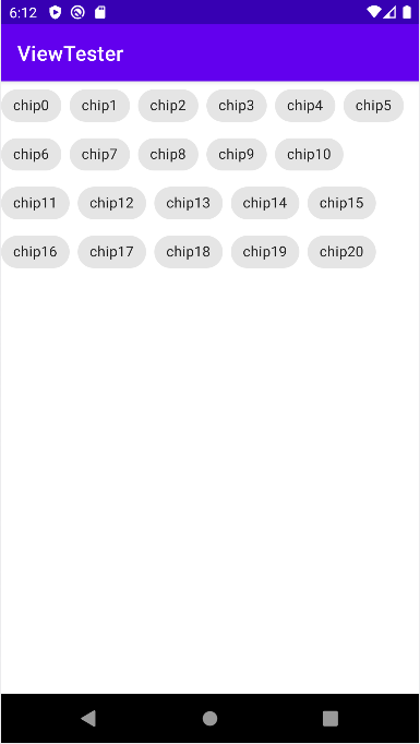
}이렇게 진행하니깐 디프만 디자이너 팀에서 제공해준 화면으로 구성할 수 있었습니다.
자세한 코드는 추후 예제 코드를 참고해주세요.
긴 글을 읽어주셔서 감사합니다.
참조
https://berkbach.com/material-design-chip-%EC%82%AC%EC%9A%A9%EB%B2%95-in-android-154f29f88241
Material Design — Chip 사용법 in Android
Usage of Chip & Chipgroup in Android
berkbach.com
https://medium.com/material-design-in-action/chips-material-components-for-android-46001664a40f
Chips: Material Components for Android
One of the cool widgets that you can use with the Material Design Components library is Chip. A Chip is a component that can represent…
medium.com
https://medium.com/over-engineering/hands-on-with-material-components-for-android-chips-21dc67c8b956
Hands-on with Material Components for Android: Chips
Part 5 of a series covering practical usage of Material Components for Android
medium.com
https://salix97.tistory.com/268
[Android] 안드로이드 리사이클러뷰에서 Flexbox 사용하기 (FlexboxLayoutManager) feat. 스크롤 없는 태그 입
1. 리사이클러뷰로 스크롤 없이 유동적인 크기의 아이템을 보여주기 Metaler 앱을 만들면서, 사용자가 입력한 태그를 리사이클러뷰를 통해 보여줘야 하는 상황이 있었다. 그런데 문제가 있었다.
salix97.tistory.com


